Designing a bold, balanced brand identity.
Sean Kennedy is a personal trainer whose coaching goes far beyond typical gym sessions. His approach blends physical fitness with mindset, consistency, and long-term lifestyle change. Despite strong client loyalty, his existing branding made him look like every other trainer — generic, forgettable, and disconnected from his unique philosophy. Sean needed a brand identity that communicated balance, credibility, and purpose from the outset.
Brand Strategy • Brand Identity
-
Sean’s reputation was strong, but his brand identity wasn’t supporting it.
He faced three core challenges:He blended in visually.
The fitness space is crowded with repetitive, cliché branding. His old identity did nothing to differentiate him.His philosophy was invisible.
Sean’s approach focuses on long-term balance across body, mind and lifestyle, but none of that came through in his branding or messaging.His brand didn’t appear confident or professional.
He needed a visual identity that would attract serious clients and reflect the quality of his coaching.
-
We built a strategy-led identity centred around the idea of balance — the foundation of Sean’s coaching philosophy.
Brand Strategy
We defined Sean’s personality, audience, positioning and tone of voice.
“Balance” became the thematic core, shaping both visuals and messaging.Visual Identity
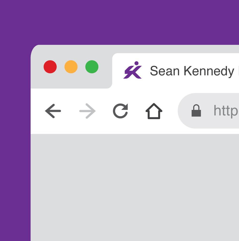
The new identity uses a custom monogram based on the initials S + K, forming a dynamic symbol that suggests movement, alignment and energy. The surrounding identity system is designed to feel: modern, bold, clear, approachable, energetic without being aggressiveThe colour palette moves away from dated fitness clichés (red, black, metallics) and instead uses fresh, uplifting tones that communicate positivity and long-term change.
Typography choices reinforce confidence without losing warmth — mirroring Sean’s coaching style: firm, grounded, but always supportive.
Messaging
We developed a simple, human, jargon-free voice that communicates clarity and encouragement.
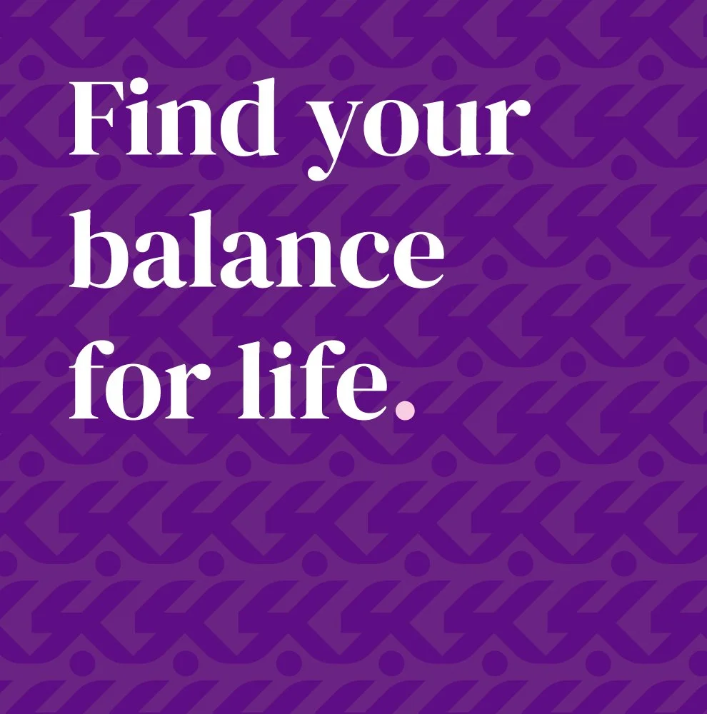
The tagline “Find Your Balance for Life” expresses Sean’s purpose in a single line. -
Sean now has a professional, distinctive brand identity that finally reflects who he is and what he stands for.
The new identity helps him:
stand out clearly in a competitive fitness market
communicate his unique philosophy instantly
appear more credible and trustworthy to potential clients
attract the type of clients who value long-term, sustainable change
The brand gives Sean a stronger foundation for growth, visually, strategically, and commercially.


In Sean’s words
Sean now has more than just a new logo. He gained a full brand identity that speaks to the quality of what he offers and gives him the confidence to grow.
In his words:
"Barry brought purpose to the design of my new logo, capturing the essence of ‘Sean Kennedy Fitness’ in the most efficient way possible."
"I never realised how much depth there was to branding until I worked with Barry. He took the time to understand what I stand for, and the result completely aligned with my vision. The whole process was smooth, creative, and genuinely exciting."
Sean Kennedy, Owner, Sean Kennedy Fitness