Modernising a contract cleaning brand to boost trust, clarity and professionalism
Schorman Cleaning is a long-established contract cleaning company serving offices, residential blocks, schools and healthcare environments across Dublin. While their operational reputation was strong, their visual identity no longer reflected the professionalism, reliability and high standards the business was known for. Their outdated branding lacked clarity, struggled in digital environments and didn’t communicate the quality or scale of the services they provided. Schorman needed a modern, cohesive brand identity and website that would better support B2B sales, build trust with property managers and facilities teams, and position the company for long-term growth.
Brand Strategy • Brand identity design • Website design
-
Schorman’s previous identity felt dated, generic and difficult to use across digital platforms, uniforms and marketing materials. In a highly competitive sector where trust and reliability are essential, their brand wasn’t sending the right signals. The old logo lacked personality and memorability, making it harder for the business to differentiate in tender processes or convey professionalism to prospective clients. They needed a modern identity system that communicated cleanliness, reliability and efficiency, while working seamlessly across everything from fleet vehicles to presentations to a new, SEO-friendly website.
-
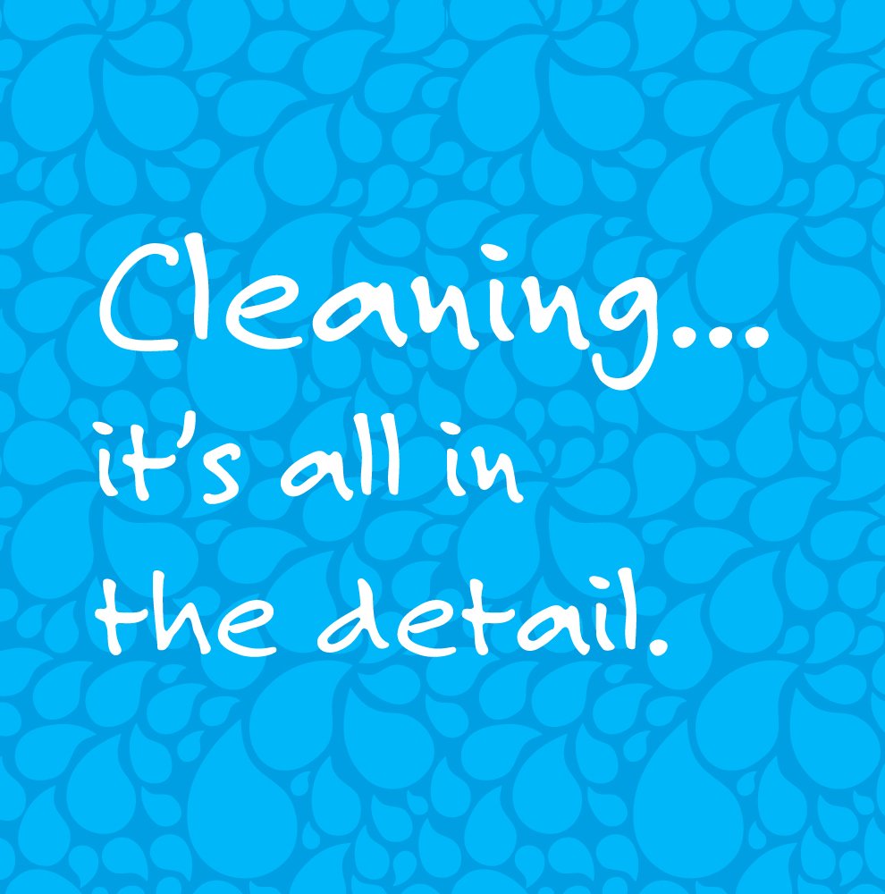
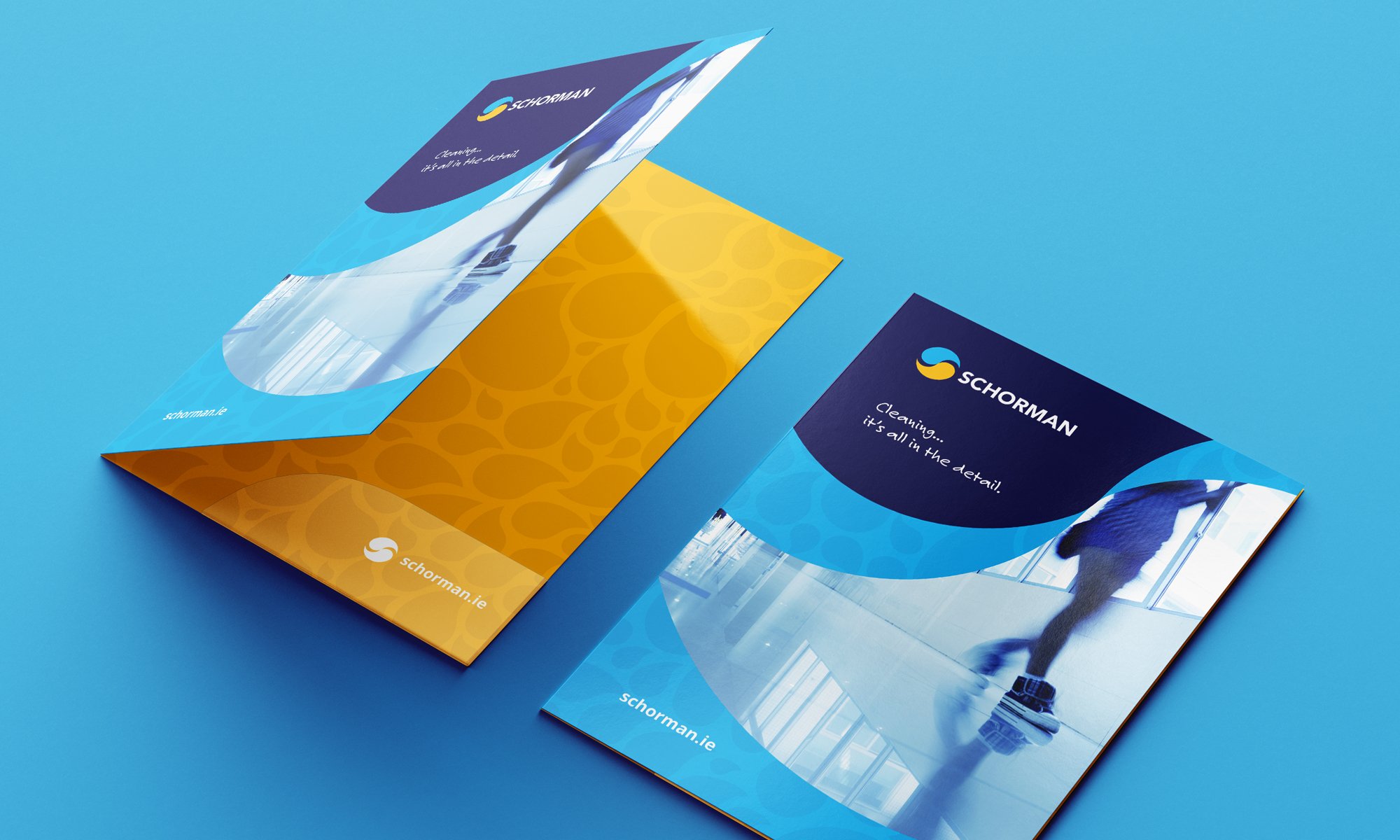
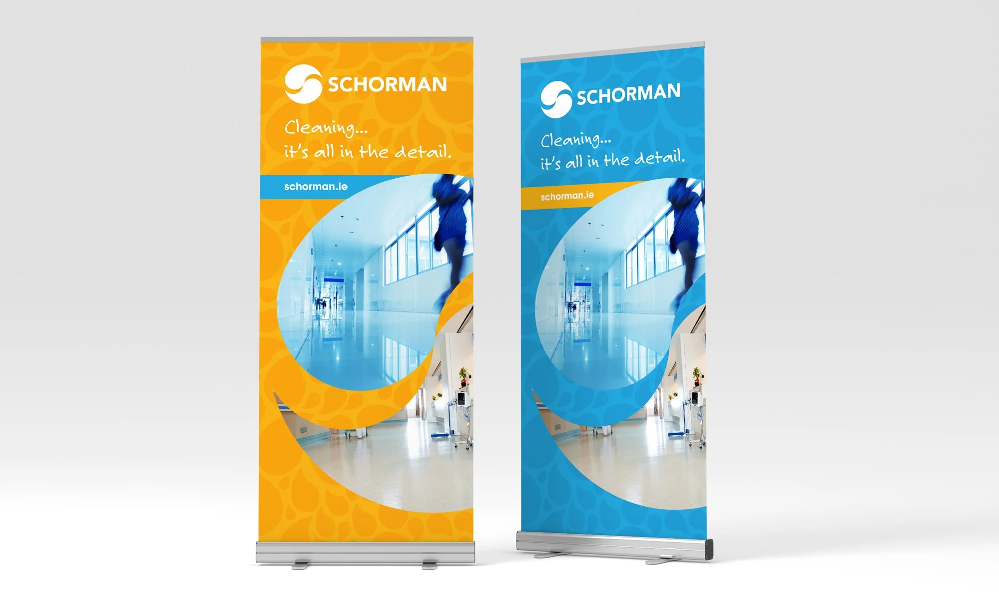
Through discovery sessions and research into the contract cleaning sector, we identified the opportunity to shift Schorman’s brand towards a cleaner, more contemporary and more corporate visual language. The new logo is built around two fluid, interlocking shapes symbolising movement, cleanliness and partnership, a modern mark that feels fresh, scalable and instantly recognisable. A refined colour palette, strong typography and a cohesive visual system reinforce professionalism across all touch points.
We extended the brand into a complete identity and website package, including layout systems, marketing collateral, uniforms and a new SEO-focused website designed to support enquiries from property managers, facilities companies and commercial clients. The updated brand is sharper, clearer and better aligned with the company’s service standards and ambitions.
-
The refreshed identity gives Schorman a modern, cohesive and professional presence across digital and physical touch points. The clearer visual system improves brand recognition, supports credibility during sales interactions, and helps the company stand out in a crowded market. The new website provides a stronger platform for B2B enquiries, reinforcing trust through consistent messaging, improved structure and enhanced usability. Schorman now presents a brand that reflects the quality of service they deliver every day.

“It was a pleasure working with Barry and the Red man media team. After liaising with them, they provided us with a full visual identity design service and a new website design. This involved building an SEO friendly website, brand new logo, and stationary suite. The results are there. My brand message is now cohesive and consistent. I’d recommend Red man’s services highly”
Derek Ivers,
Director, Schorman Cleaning