A new homes logo that tells the story of the place.
Millerstown is a development of three and four bedroom family homes on the Maynooth Road in Kilcock, beside the Royal Canal, built by McGarrell Reilly. I designed the logo while I was running my agency, Red Man Media. I wanted a mark that could only ever belong to this place.
A new homes development in Kilcock needed a logo that buyers would remember, in a market where many schemes look alike. There was no brief.
Discovery and research into the place, then a logo built from what was really there: the old corn mill, the canal and river, and the new bridge at the entrance.
The logo is still in use today, and it's on the Millerstown website.
No brief, so the first job was finding one.
There was no design brief. So before drawing anything, I did the discovery with the client: what the development was, who it was for, and what made this patch of Kilcock different. I started with what the developer could share: a location map, the site layout, and the engineers' drawings for a new bridge at the entrance. That bridge drawing turned out to be one of the most useful things in the pile.
New homes brands often lean on the same few ideas: a rooftop, a tree, a swirly script. Buyers see dozens of them. I wanted Millerstown to have a mark people could connect with Kilcock, and with nowhere else.
Looking for what was really there.
The name pointed the way. An old map of Kilcock marks a corn mill just outside the town. The Royal Canal runs right beside the site, and the new bridge would be the way in for every family living there.
That research became the brief. The logo had three jobs: honour the past, show off the setting, and point to what was coming next.
Plenty of ideas, then a shortlist, then one.
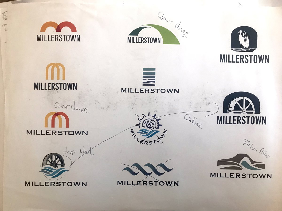
The first round went wide: overlapping arches, a heron in the reeds, layered water, the mill wheel on its own. I marked up the printouts with my own notes and narrowed it to a shortlist of six. The route that won was the one that brought all three stories together.
Past, present and future in one badge.
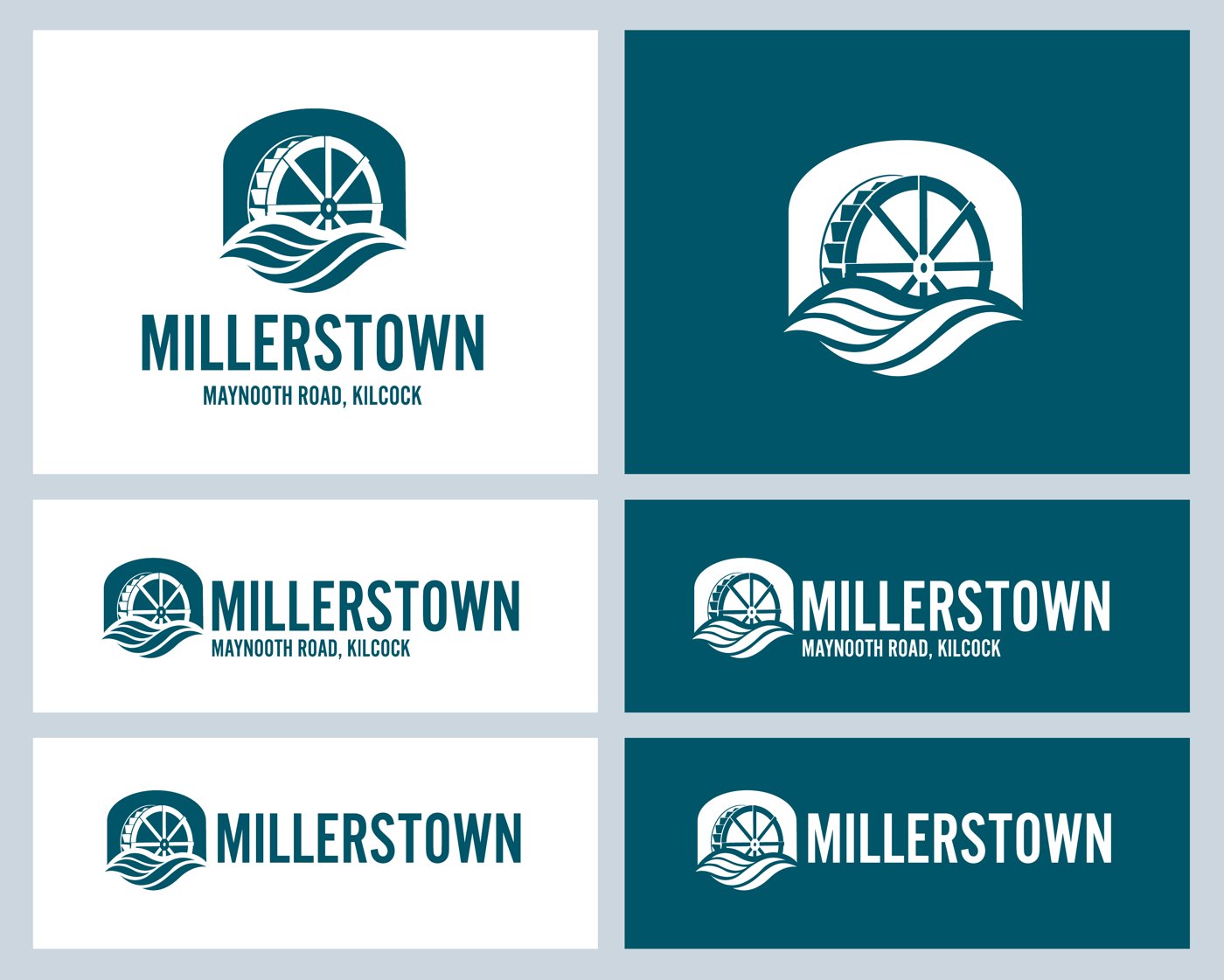
The mill wheel is the past, a nod to the corn milling that gave the area its history. The water beneath it is the present: the Royal Canal and the Rye River, and the calm they bring to the place. The arch that frames it all is the new bridge, the future, linking the new homes to the town.
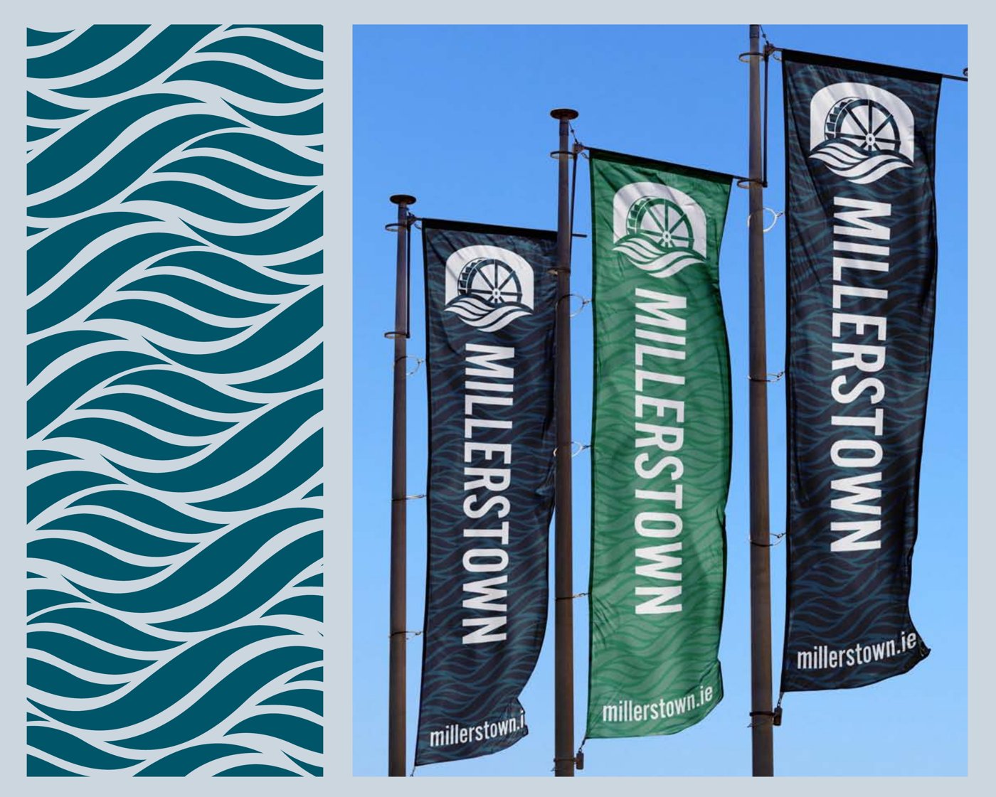
It all sits in one simple badge, clear enough for a flag on the road and small enough for a phone screen. And every part of it means something to the people who live there.

Still in use, years later.
The developer's marketing agency, Cream Creative, took the mark into the sales brochures and website. They set it in green, put it on the cover and even used the wheel as a faint watermark behind the floor plans.
By the time a later phase went on sale, the bridge was built. The same bridge that gave the logo its arch now welcomes buyers on the opening page of the brochure. And years on, the logo is still in use, and you can see it on the Millerstown website today.
Launching, growing or changing? Let's talk about your brand.
A 30-minute call about where you are and what your brand needs to do. No pitch. If you're not ready to talk yet, ask for a free review of your current brand instead.