Positioning a new independent Estate Agent for credibility and Long-Term growth.
After years in major estate agents firms, John O’Sullivan launched his own independent estate agents consultancy, focused on offering calm, honest, and expert guidance to clients across South County Dublin. To stand out in a saturated property market, he needed more than a name and logo: he needed a brand that would inspire trust, feel personal, and reflect the quality of his service from day one.
Website: www.josp.ie
Brand Strategy • Brand Identity • Website UX/UI Design
-
Despite his strong reputation, John’s visual identity lacked distinction. A generic, templated logo and no clear messaging risked positioning him as just another estate agent, rather than the experienced, calm, and trusted consultant he actually was. In a crowded market of similar-looking competitors, first impressions mattered. He needed a brand that would immediately earn trust and clearly express his difference.
-
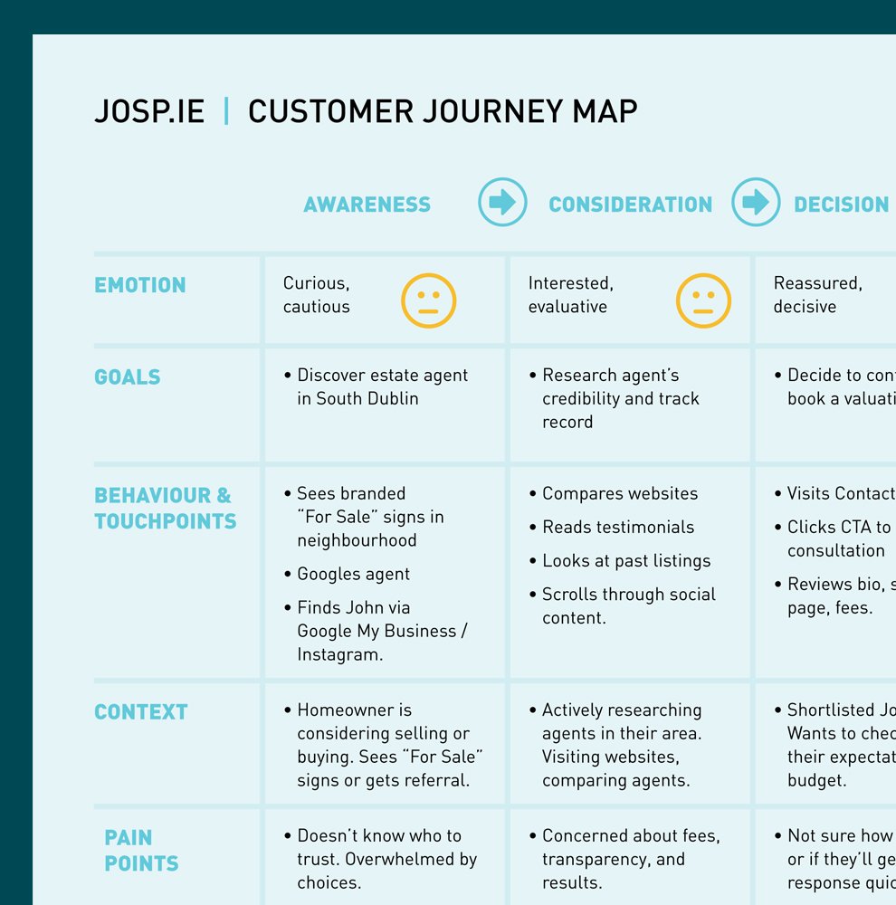
We began by defining a brand strategy anchored in three key principles: trust, guidance, and professionalism. This strategy became the foundation for a refined visual identity system, using purposeful spacing, confident typography, and a restrained colour palette, all designed to communicate calm confidence rather than flashy corporate sameness.
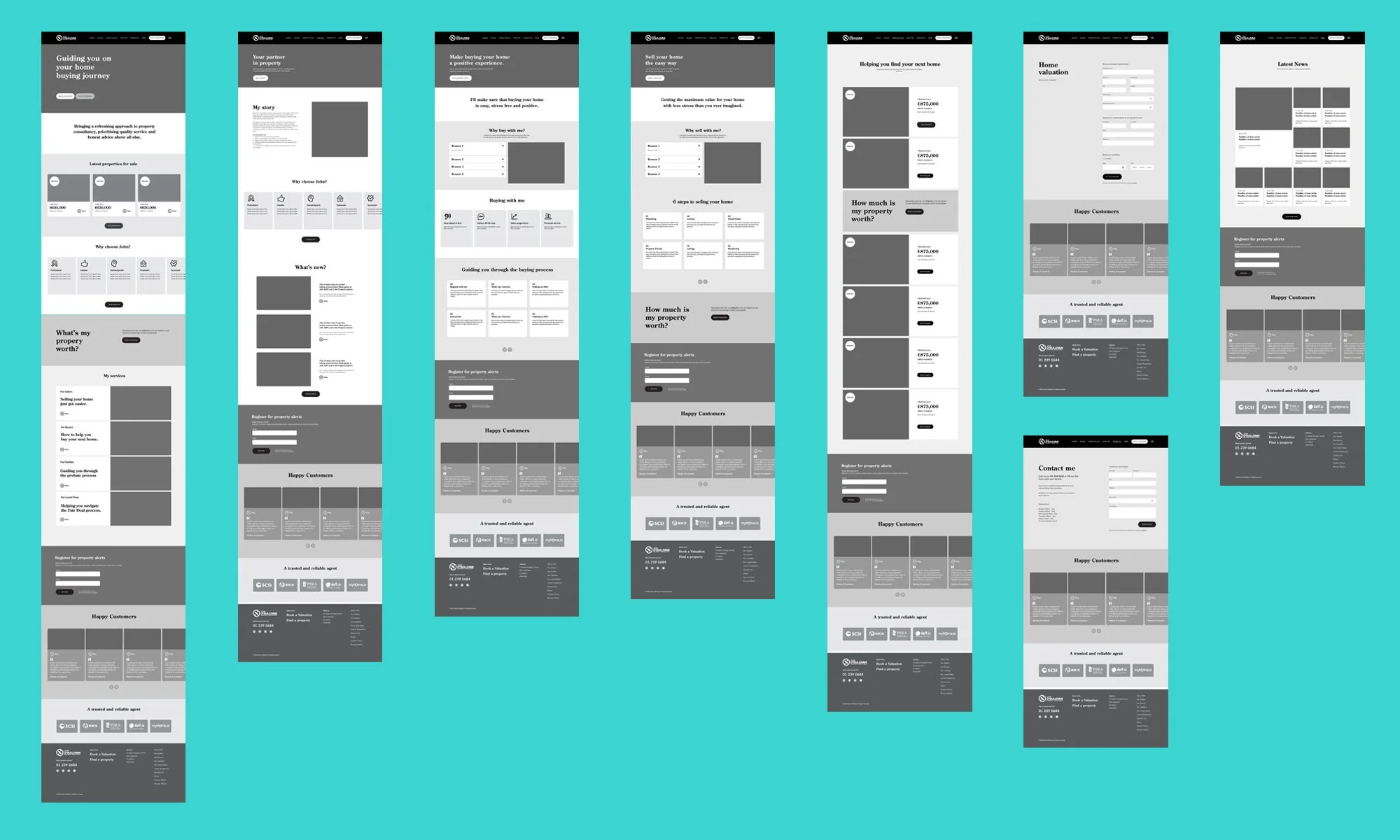
The identity extended across key touchpoints, including stationery, marketing materials, and a custom-designed, mobile-friendly website. The website experience was designed around clear messaging, intuitive navigation, and professional presentation, giving prospective clients a seamless path to learn, trust, and get in touch.
-
John now presents a cohesive brand that truly reflects who he is: a trusted, personal, boutique property consultant. Within 3 months of launch he had generated €4M+ in property sales, with direct enquiries coming through the website from day one. The return on his brand investment was 280%, realised in under 90 days. Not a 12-month story. A 3-month one.
His new identity and online presence haven’t just elevated how his business looks, they’ve become active tools in winning client trust, attracting higher-value listings, and standing out in a crowded market.


In John’s words
“Barry asked me questions I’d never thought about before. My original vision was quite traditional, but he opened my eyes to other possibilities. What we landed on is something I’m proud of, it stands out and feels like me.”
“I’ve worked with plenty of designers in corporate firms, but going out on my own was a completely different experience. Barry helped me not just define my brand, but think ahead to what I’d need next, before I even realised it myself.”
John O’Sullivan,
Managing Director, John O’Sullivan Property Consultants