Camden Recruitment Partners is a boutique financial recruitment consultancy specialising in senior roles across Dublin’s competitive finance sector. As a new firm entering a crowded market, they needed a brand identity that would immediately communicate credibility, professionalism, and a people-first approach. With no existing brand or visual system, the goal was to build a complete, cohesive identity that reflected their expertise and ambition from launch.
Brand Strategy • Brand Identity • Launch
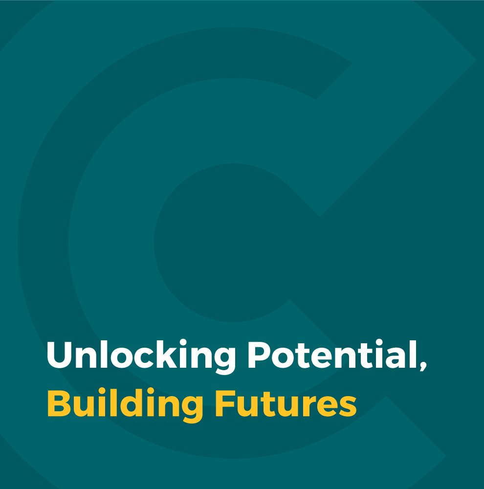
Creating a credible, distinctive brand identity
-
Camden had strong industry experience but no brand foundation to support it. They needed to define who they were, how they wanted to be perceived, and how to visually differentiate themselves in a sector dominated by corporate clichés.
Key challenges included:
Standing out in a serious, competitive market
Financial recruitment firms often look alike — conservative colour palettes, predictable design, and little personality.Communicating expertise without feeling cold or corporate
Camden wanted to signal trust and professionalism while also reflecting their approachable, relationship-led ethos.Building a full identity from scratch
With no logo, system, or messaging, they needed a complete brand that could scale across print, digital, and future campaigns.
To launch successfully, Camden required a brand identity that balanced authority with human connection.
-
We started by defining Camden’s positioning, personality and core attributes: specialist expertise, partnership, and a human approach to recruitment. This strategic clarity informed a visual identity designed to stand out in a conservative market while remaining professional and credible.
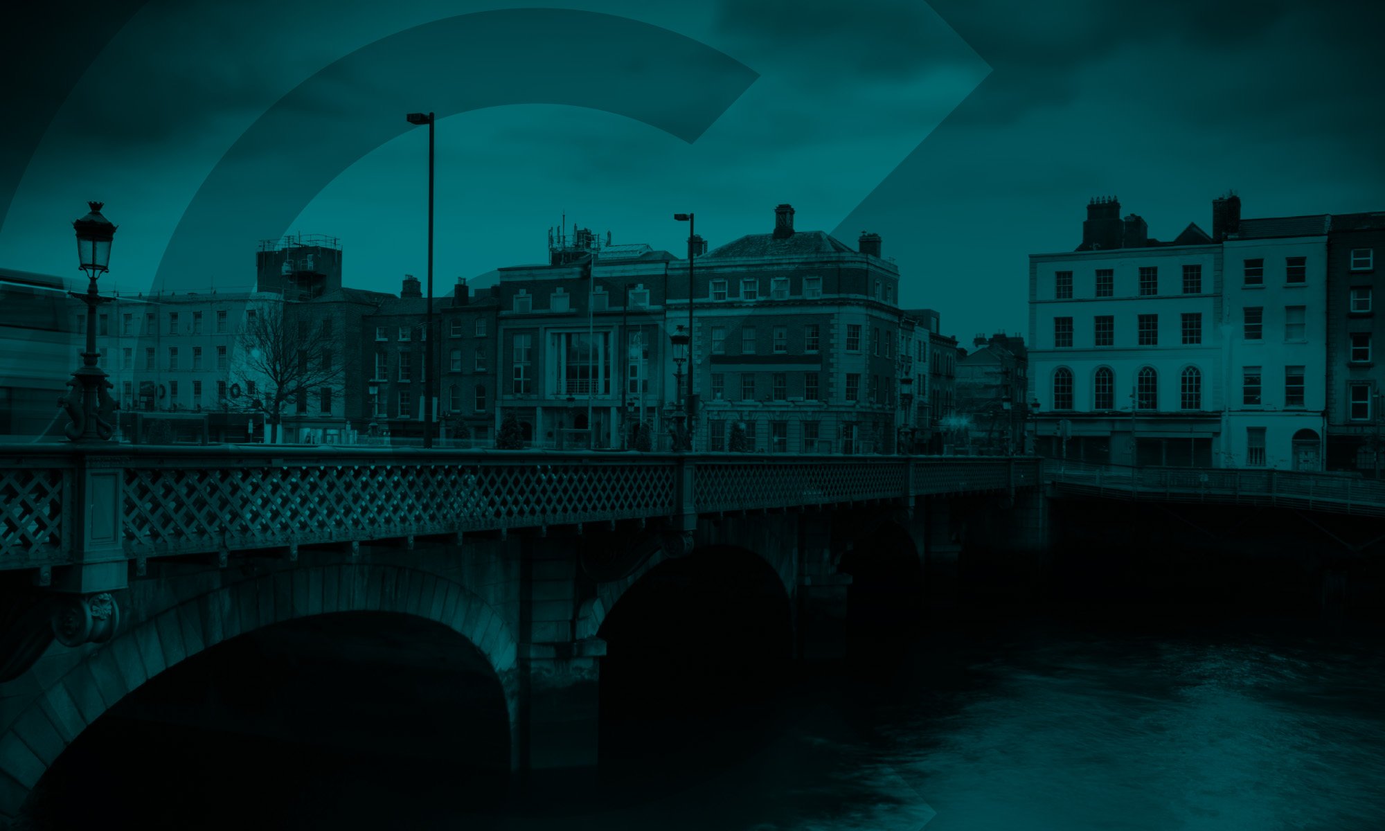
The new logo uses two interlinked forms to represent partnership and long-term relationships — the foundation of Camden’s work. A modern, warm colour palette differentiates them from typical finance brands, while clean, versatile typography supports clarity across reports, digital platforms and marketing materials.
To ensure consistency from launch, the identity was expanded into a full brand toolkit, including guidelines, messaging foundations, and ready-to-use assets for digital and print.
-
Camden launched with a clear, confident brand that communicates their expertise and people-first approach.
The identity differentiates them in a competitive market, helping them earn trust early and present themselves with the authority expected in senior financial recruitment.
Stakeholders responded positively, and the brand gives Camden a strong platform for future growth.


In Mark’s words
“Barry is an extremely creative designer. His brand identity work hit the mark and provided great results for our business. I highly recommend him for any brand design related projects.”
Mark Stephens,
Director, Camden Recruitment Partners